IMPROVING User experience THROUGH MARKETING SITE REORGANIZATION

PROJECT YEAR:
2022-2023
ROLES & RESPONSIBILITIES:
User Research
Information Architecture
HOMEPAGE REDESIGN IMPACT:
Boosted new user acquisition by 20% with cohesive, informative design strategies.
Aligned design foundations with product, strengthening branding continuity.
Problem Statement
The Hello Alice marketing website aims to attract aspiring business owners seeking opportunities for small business expansion. However, user dissatisfaction has grown due to perceived unintuitiveness and burdensome navigation. The homepage fails to effectively communicate funding options, and partners need clearer insights into supporting Hello Alice initiatives. Thus, a comprehensive update of the marketing site is needed to address concerns from both partners and owners.
Phase 1: Gain insights into target audience
USER INTERVIEWS:
Prior to proceeding, I deemed it important to acquire a comprehensive understanding of the pain points experienced by both our owners and partners. In order to accomplish this, I curated a group of five participants and conducted in-depth interviews and asked them to perform specific tasks to gain profound insights into their challenges. This process allows me to discern and address their pain points effectively, thereby devising optimal solutions.
Questions I asked:
Can you kindly provide a description of your initial experience while utilizing the Hello Alice website?
Did you encounter any difficulties in navigating the homepage and locating the desired information?
From the perspective of a partner or small business owner, is the homepage effectively conveying the initiatives and objectives
of Hello Alice?
Tasks I asked them to perform:
How would you go about gathering additional information regarding grant programs and the application process? Similarly, could you provide insight into the process of applying for the Hello Alice credit card?
How would partners go about accessing their pages from the Hello Alice homepage?
SUMMARY OF INTERVIEW RESPONSES:
Participants had diverse initial experiences with the Hello Alice website, appreciating its minimalist aesthetics but pointing out issues with section organization, emphasizing the need for navigation improvements. Partners struggled to locate their landing page, raising concerns about supporting Hello Alice initiatives. Owners faced difficulties finding grant program information, leading to a lack of clarity. Suggestions included refining search functionality, personalized content recommendations, and featuring success stories.
Thorough interviews revealed a need for two distinct landing pages to explain Hello Alice's initiatives for users signing up as owners or partners. Currently lacking, these pages would provide comprehensive explanations before directing users to the homepage. The website's navigation structure oversight, particularly the absence of sub-navigations and drop-down menus on the homepage, poses challenges in organizing and locating specific sections. Implementing such menus would greatly enhance organization, clarity, and seamless navigation for users.
Phase 2: Develop a research-based plan to reorganize the website
Card Sort:
Before initiating the architectural reorganization of the Hello Alice website, I conducted a card sort activity to gauge how our existing owners would categorize specific cards. This card sort was administered to a sample of the same five owners, and the results provide valuable insights into the organization of the cards. This was the result of the card sort:
Create Updated Sitemap:
Leveraging the insights gained from the card sorting exercise, I devised a structured navigation system. This version of the sitemap showcases the proposed reorganization, including the introduction of sub-navigations, thereby reflecting the enhanced clarity and organization that can be achieved.
Task Flows:
After finalizing the architectural framework, the next step was to develop comprehensive task flows to delineate the precise steps and interactions that users would undertake to achieve specific goals or tasks. In designing these task flows, we placed significant emphasis on accommodating the distinct needs of both partner and owner users, ensuring that the flows catered to their respective requirements. To accomplish this, we delineated individualized tasks for each user segment, taking into account their unique perspectives and objectives. Through this process, the following task flows were crafted to provide a seamless and optimized user experience for both partners and owners:
PHASE 3: design mobile mockup
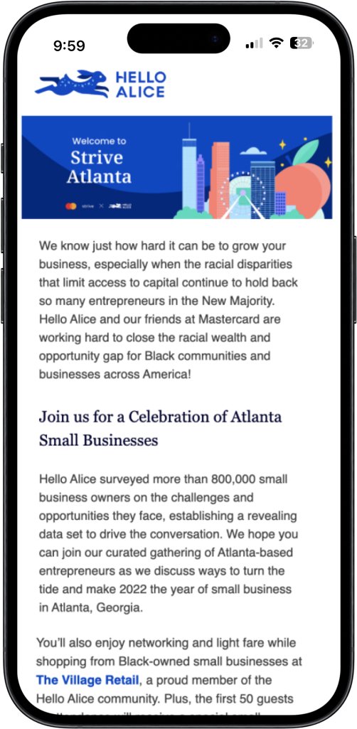
Building on the insights gained from our research and the established flow in the preceding phases, I crafted a visual representation illustrating the user's journey on a mobile device. This mockup captures the seamless transition from the email interaction to the funding page, providing a tangible visualization of the user experience we aim to achieve. This visual depiction serves as a valuable tool for further refining and fine-tuning our design approach to ensure a user-friendly and engaging pathway throughout the entire process.


next phase: Tracking and Iterating on User Engagement Using Online Tools
After implementing our reorganization efforts, I sought to assess the impact of these changes on our user engagement. The following steps outline my approach to analyzing new user engagement using tools such as FullStory and Google Analytics:
Created a dedicated segment targeting new users to concentrate on user growth. Additionally, we were keen on understanding the conversion rate from initial interaction to user sign-ups.
Reviewed session replays of users within the new user segment. This in-depth analysis allowed me to observe how new users interacted with the Hello Alice homepage, enabling the identification of patterns and pinpointing potential pain points.
Implemented surveys and feedback forms to gather insights directly from new users. This proved invaluable in gaining a deeper understanding of their overall experience.
Utilized Google Analytics to track new user growth. The analysis revealed a notable 20% increase in the number of new users, providing quantitative validation of our efforts.
Consolidating our findings, the next crucial steps involve iterating on the user experience. By addressing identified pain points, we aim to enhance user satisfaction and, ultimately, increase the conversion of users to sign up for the Hello Alice product.
This comprehensive approach, combining qualitative insights from FullStory with quantitative data from Google Analytics, positions us well to refine our strategies, foster user engagement, and optimize our platform for increased conversions.