
redesigning Maxim's identity and design system

PROJECT YEARS:
2013-2014
ROLES & RESPONSIBILITIES:
Art Director
Editorial Design
Competitive Research
Photo Direction
Infographics
RESULTS & RECOGNITION:
Achieved a 5% growth in advertisements
Implemented an upswing in fashion-related advertisements
Received a nomination for the prestigious SPD (Society of Publication Designers) award for redesign efforts
PROJECT OVERVIEW
Unaware at the time, my encounter with the UX process took place long before my enrollment in UX boot camp. Upon reflection of my rebranding work at Maxim, I recognized its alignment with the fundamental principles of the UX process:
Understanding the scope and objectives set by the new owner for the rebrand and identifying our new target audience
Delving into our existing pain points to avoid replicating prior design mistakes
Analyzing our competitive landscape
Researching the preferred design style we aimed to emulate
Navigating through the intricate phases of design, iteration, and finalization
The design process underwent numerous time-consuming iterations, emphasizing the importance of thorough and meticulous refinement.
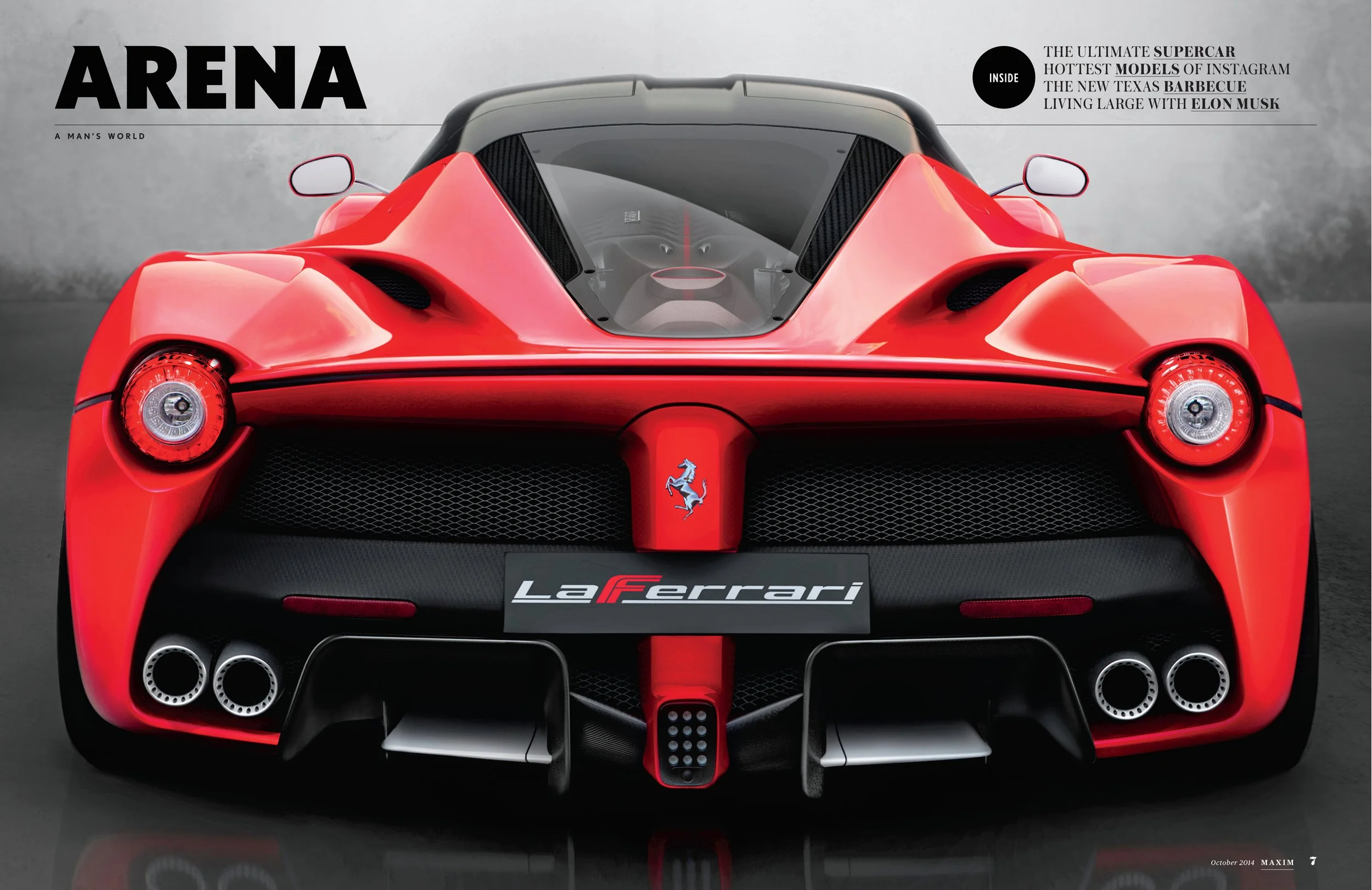
Problem Statement: The magazine's original designs were aimed at a youthful audience, primarily college students to those in their mid-20s. However, following Maxim's acquisition by a new owner to appeal to an older and more sophisticated demographic, we undertook a comprehensive rebranding initiative. Our objective was to cultivate a more mature image, emphasizing fashion content to rival publications such as GQ and Esquire. This encompassed a complete overhaul of the design system, grid foundation, photography, and typographic treatment of the magazine.
What did maxim look like before the redesign?
To engage a younger audience, Maxim integrated vibrant colors, customized typography, and infused humorous editorial content and illustrations. Maxim was frequently perceived as a lighthearted magazine that resonated with a more playful demographic. Here is a small sample of Maxim's previous appearance before the redesign:


phase 1: refresh
THE CHALLENGE: Generate a redesign solution within a tight deadline on such short notice.
THE SOLUTION: We enacted a stopgap measure, allowing us additional time to craft a more comprehensive plan for a refined overhaul. Acknowledging the complexity of achieving a perfect redesign initially, our focus was on delivering an interim outcome to our new owner. Following thorough deliberation, we outlined the first phase of the redesign:
Refine the editorial voice to convey a more mature tone by eliminating playful and immature content.
The photo department opted to maintain the current tone. However, they were granted an increased budget to hire photographers instead of relying on stock photography.
The design team collaborated with the edit team to breathe life into the front-of-the-book section. Introducing new section titles and content, we devised a fresh design that presented a more sophisticated appearance throughout the magazine.
Here are some examples of temporary refresh:


phase 2: explore methods to differentiate from our competitors
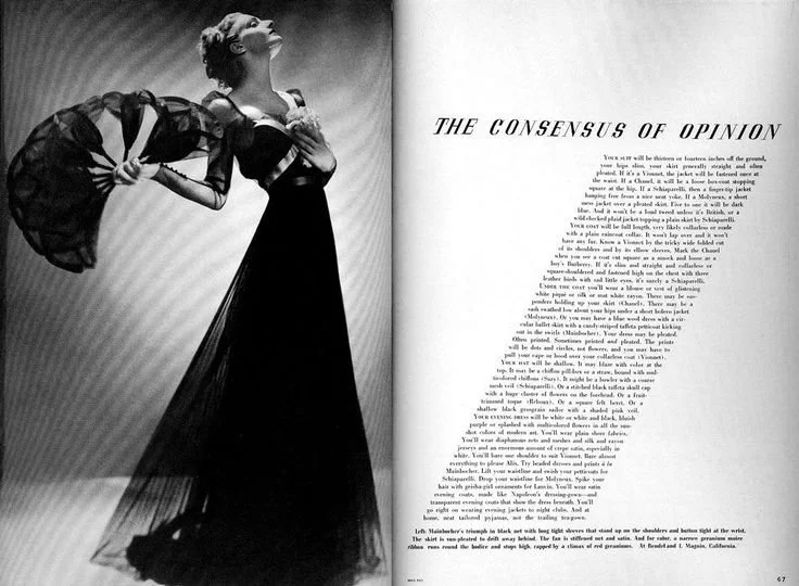
We initiated our redesign journey by analyzing our competitors and evaluating their strategies. We sought to understand their actions at the time and identify ways to set ourselves apart. During this phase, prominent publications such as GQ, Esquire, and Men’s Journal embraced vibrant colors in photography, fashion, typography, and design. As a team, we aimed to distinguish our approach from prevailing trends. After careful consideration, we reached a consensus to revive a vintage aesthetic for Maxim. The challenge, however, was defining the specifics of this revival. The design team extensively researched archives from the 70s and 80s, curating examples that we believed could embody the envisioned new look for Maxim. Below are some samples of our creative exploration:
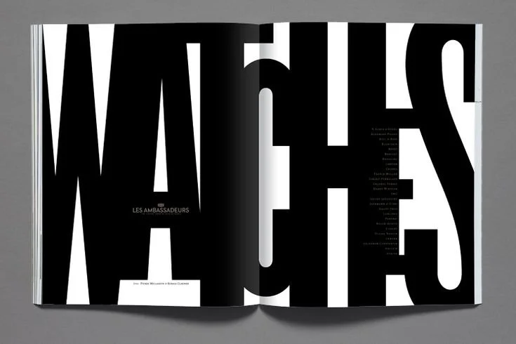
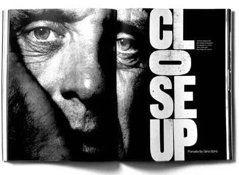

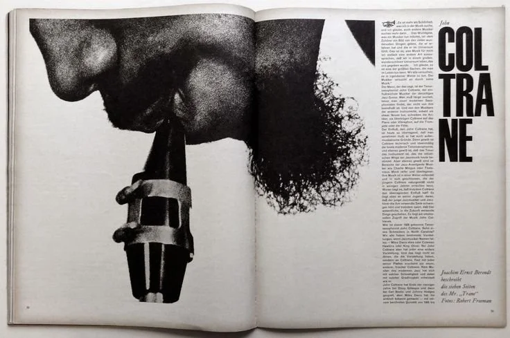

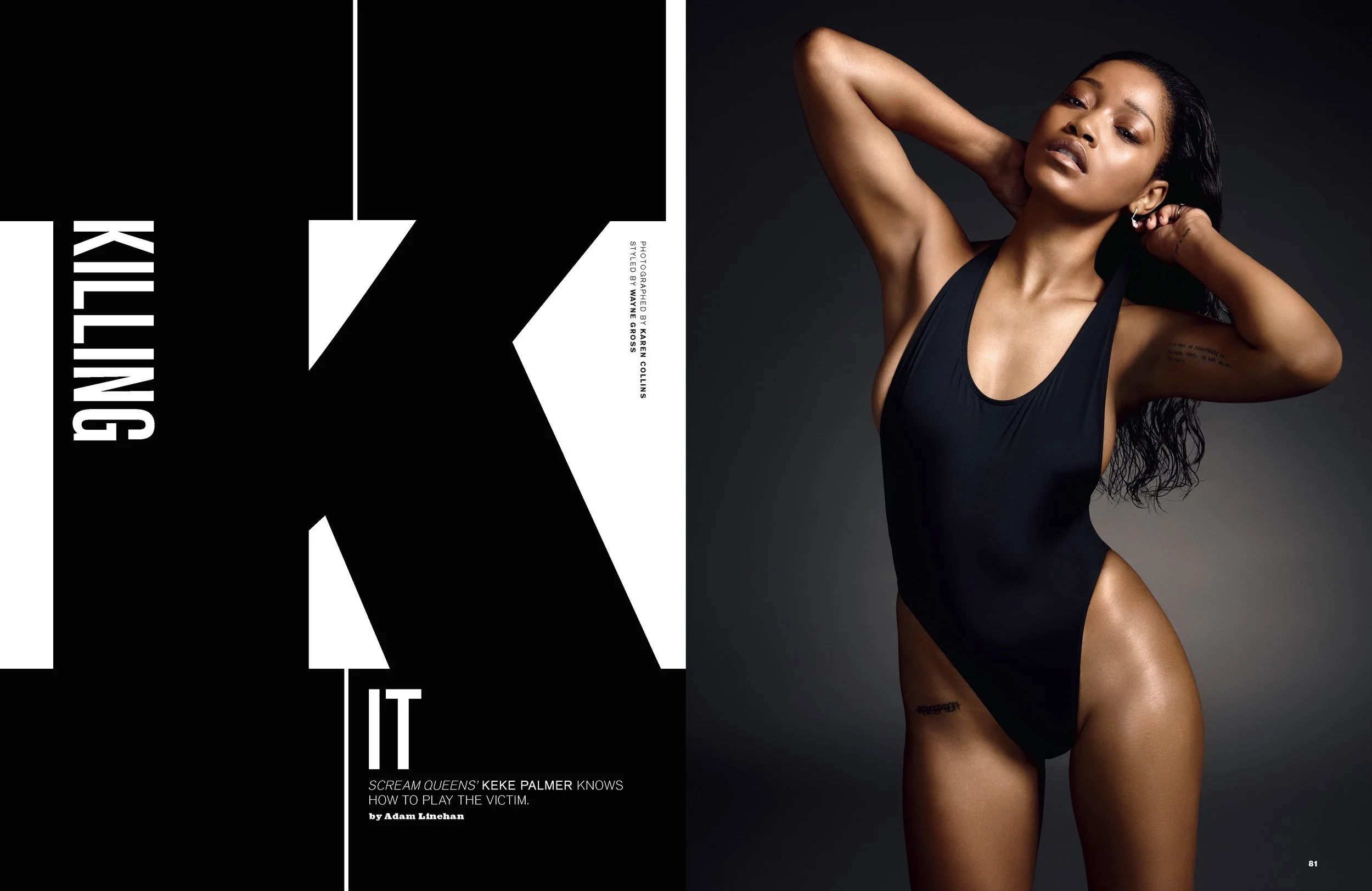
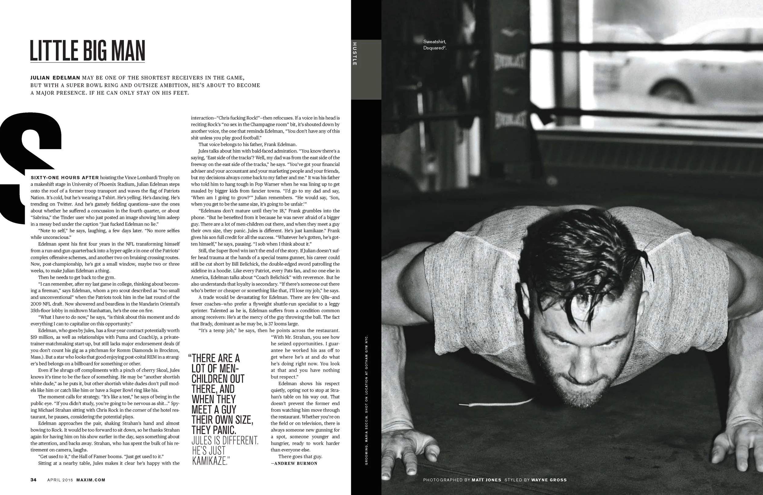
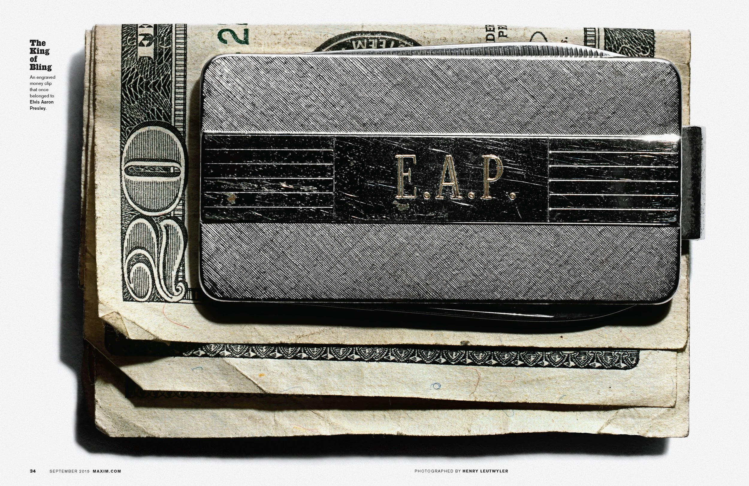
After thorough research, we opted to experiment with the implementation of a structured Swiss-style grid foundation while incorporating bold and aggressive typography. Our vision included embracing a black-and-white photography and illustration approach to maintain a consistent color palette across the magazine, with subtle touches of infused color. The integration of black-and-white photography and typography was chosen to impart a level of sophistication uncommon in most magazines.
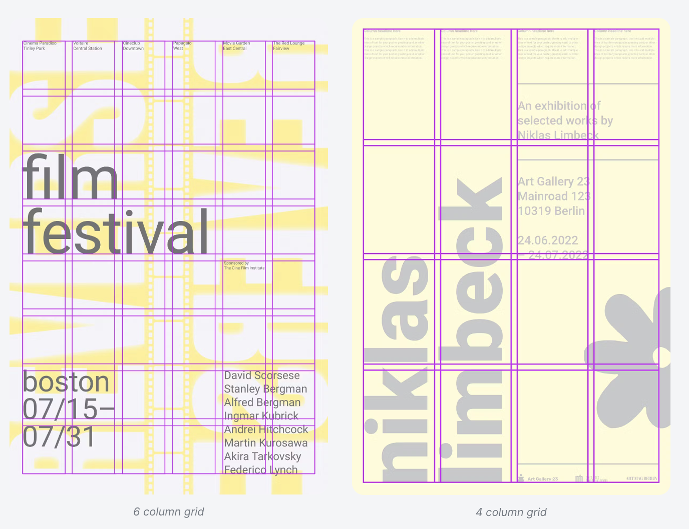
phase 3: Updating our design system
The first step to updating our design system was to update our overall grid structure and baseline grids. To establish a more cohesive design system across the magazine, we opted to adopt a Swiss Mathematical Design Grid. Mathematical grids were deemed "the most legible and harmonious means for structuring information." Websites, for instance, are segmented into flexible grids to establish a clear hierarchy of information. This approach extends even to smartphones, where a grid is provided for capturing images, ensuring precision in the positioning of pictures.
This new system introduces a horizontal grid, enhancing the overall structure of the layout and bringing more consistency throughout the magazine. Below is an example of what this new grid system would look like:
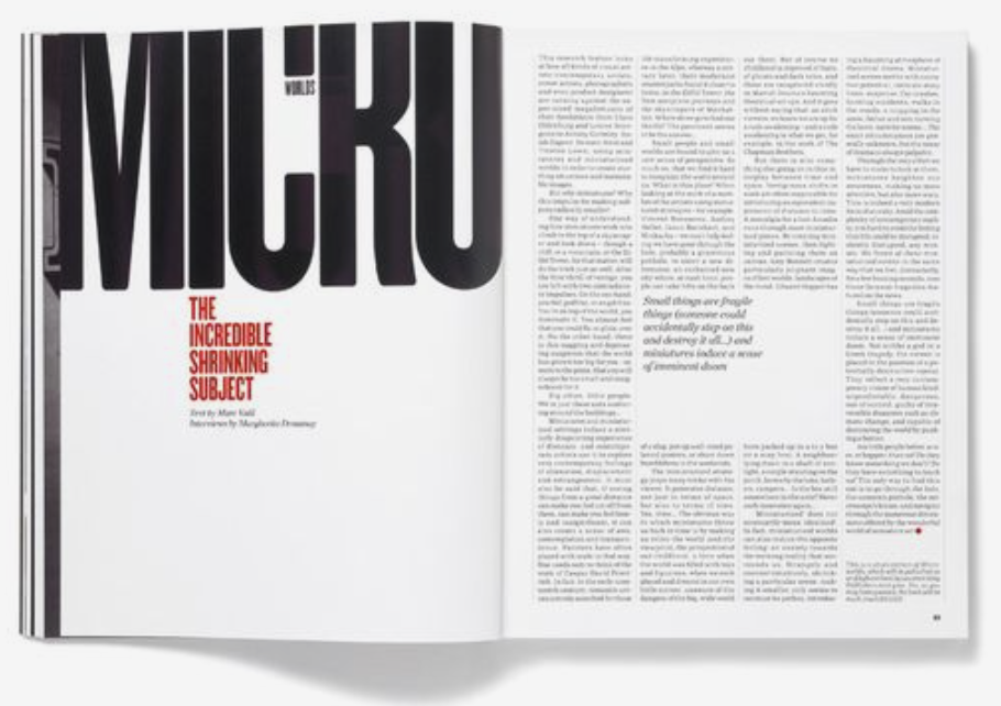
After refining our grid foundation, we acknowledged the significance of discovering a new font capable of effectively conveying the bold and aggressive typographic treatments we aimed to emphasize in our feature well. Our exploration led us to seek a condensed modern font that’s versatile, spans a wide range within the type family, and is accessible.
The pursuit of the perfect font involved several iterations, and we ultimately decided on Akzidenz Grotesk for our display font. With the selection of the appropriate font, we proceeded to update our style sheets and implement typographical components that would consistently run throughout the magazine.
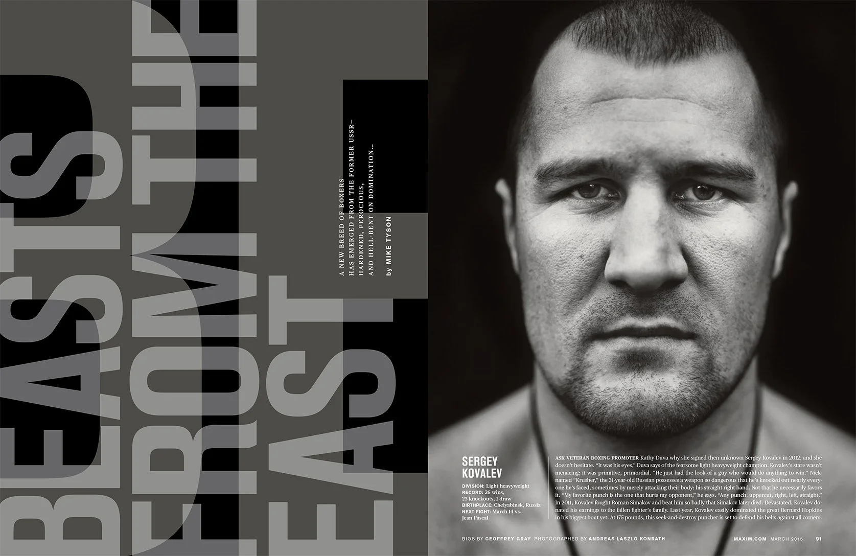
phase 4: final design
After numerous rejections, iterations, and overtime efforts, we successfully developed a design that garnered approval from all stakeholders at Maxim. We believe that this version of the design captured the unique, vintage, and sophisticated look we were aiming for. Here are some samples of the final redesign:


Concluding Thoughts and Outcomes
The comprehensive rebranding of Maxim demanded nearly a year of dedication and effort from every individual involved in the project. While the journey was challenging, it stands as a unique and invaluable experience that few in the editorial industry will ever encounter. Throughout this transformative process, I gained a wealth of knowledge and skills.
Notably, we witnessed a remarkable 10% growth in advertisements, successfully executed a strategic upswing in fashion-related advertisements, and earned a coveted nomination for the prestigious SPD (Society of Publication Designers) award in recognition of our outstanding redesign efforts. These accomplishments not only underscore the effectiveness of our endeavors but also highlight the team's commitment to excellence and innovation in the editorial landscape.